Archives for category: Taglines

Conversion Conference Tagline (Duplication)Salary.com taglineSinger Tagline (Duplication)

Within branding, little is more annoying than seeing a company blow a great messaging opportunity: a name or part thereof that repeats itself in the tagline. And a few more:

Ally Bank            Everyone needs an ally.
CenturyLink        Your link to what’s next.
Vahan                 Alwand Vahan

Such lack of creativity doesn’t speak well for the discipline or the “disciplineer.” Rather than slapping a flat, thoughtless tagline under the name, leave it out.

A tagline is not the place to “tell them what you’re going to tell them” and then “tell them,” because you’ve then run out of time and space to “tell them what you just told them.” Doubling up on the name in the slogan is disrespectful to the audience…and just as you were getting their attention! In fact, not being able to come up with a short, original phrase that complements and/or reinforces the name is a common brand wasteland. Most “straplines” (as they are called in the UK) are largely visually experienced, so it is all the more surprising to see how many resources go towards a name and logo, leaving the tagline to be the afterthought and looking it all the way.

A good tagline furthers brand messaging and and strengthens positioning. As a name usually only conveys two or three traits, the tagline is the chance to say something strategic about the brand that did not make it into its hardest-working asset. Great taglines — you’ll recall “Just do it.” and “We bring good things to life.” — are born from compatibility with the naming structure and style, the sharing of additional meaning, a passion revealed and a personality defined. They transcend their typical real estate, emerging literally and figuratively out from underneath the respective name to achieve stand-alone stature and staying power in their viral journeys.

Before we leave, let’s get to some general fixes. One option is to simply remove the word or wordmark from the tagline when the two appear together, as with Singer. This may require a little tweaking of the initial phrase. Nothing fancy. Salary.com could swap out “salary” for “figure” or “number.” Either is much more interesting and adds depth. With the Conversion Conference, it may take several words or a phrase to stand in for the repeat offender. Nothing major; a quick read of the session topic blurbs and the logo give me several ideas already. Lastly, Vahan should start over. Without visual cues, some previous knowledge of the brand or seeing the domain, vahanjewelry.com (at the bottom of a recent ad showing retailers that carry the line), I have no idea what the company stands for or sells.

Given the difficulty in securing a legally-viable name and domain, the tagline can and often is a name’s best friend. If you’re strapped for creativity and time, Devign can find you both. Strapping results and in spades.

An un-medicated high.

An un-medicated high.

Needing to quench my thirst, I bought this Indian carbonated water for the illustration and tagline combo as well. I was already in the Himalayas, heading to Bhutan or on my way back. So, there!

Next logo change, I’d move “Lehar” to the bottom or back and let the mountains and “Evervess” take the spotlight. The maker’s prominent display (on its bottles and snack packages) is akin to “The Coca-Cola Company” splashed center stage on every beverage it sells, regardless of whether Coke, Sprite or Dasani is inside.

“Evervess” is powerful. It’s evocative, fun to say and onomatopoeic. Starting off strong with the stressed initial “E,“ the name then softens out…much like any gaseous beverage action. What’s more, it’s suggestively descriptive: the drink is super-fizzy, as another fan attests. — ¡!¡!¡!¡!¡!¡!¡!¡! — I love the visual and verbal references to both “effervescent” and Mt. Everest. Bubble on!

Backstory: Lehar is a brand of soft drinks and salties owned by PepsiCo. From 1988, when the company entered the subcontinent’s market, until the ban on using foreign brand names was lifted in 1991, PepsiCo was forced to use an Indian name, even on its flagship drink. Pepsi Era? Not allowed. Lehar Pepsi (lehar = wave)? Approved. PepsiCo marketed its products under this former Indian joint venture label until it bought out its partners in 1994.

Sourced: Thailand/Bhutan.

This tagline's got legs!

This tagline’s got legs!

Emma Hope shoes are understated elegance. Investment pieces, not gaudy statement ones like those we’ve seen more and more over the last decade. Gorgeousness you can actually walk in and wear for hours. I love this tagline; it complements the fine workmanship, attention to detail and tactile heaven of handcrafted functionality. “Regalia for feet” even feels comfortable! I miss pretty shoes.

It is puzzling why high-end labels and cordwainers continue to ignore common sense at the expense of looking out-of-touch. Their own faddish egos are damaging their brand. A six-inch plus heel is not unique, stylish or innovative. It is fast fashion, stalled. Such lack of creativity catapults a domino effect: season after season, hyper-competitive, self-obsessed designers churn out more pairs that are increasingly sold at a discount and at steeper price cuts. This is neither good business nor brand strategy. The over-priced, ankle-twisting excess I’m referring to is nothing short of slutty, tasteless, quickly dated footwear. (Honey, call the podiatrist!)

I dare designers to come down off their stilettos! Make something to be proud of twenty years from now. Do it for us and for the archives. And ladies, while you wait, get a pair by Emma and you’ll agree: simple is usually the answer.

IMG_1480

All-weather, all-natural, all-terrain comfort.

Given my weakness for colder weather and passion for the polar and high-latitude regions, I’m happy to report that this base, layering and outerwear line is as high-performing as the name. Close-fitting, stylish, warm, itch-free and with quality zippers. These are the pieces you’ll wear ‘til the sheep come home. Baaaaaaa!

Even if you never break a sweat or step off the sidewalk, this is wool like you’ve never seen, felt or smelled. The “Think, don’t stink.” tagline is a layering of its own kind… a meaningful, catchy and memorable phrase that adds energy and fun to the brand.

Leave it to the Kiwis to take us back to the sustainable farm and the four-legged beginnings of what’s on our own two now. Per their unique “baacodes,” I traced my light-grey top to a single ranch, Kennethmont. My dark grey top’s fibers come from four of 120 sheep stations: Lindis Peaks, Glenmore, Otematata and Waitangi. Thanks, Icebreaker, for “new-schooling” wool.

IMG_1478

Hands-on clean.

Last summer I flew Canadian North, which is 100% Aboriginally-owned, from Inuvik to Norman Wells, then to Yellowknife and on to Edmonton. Really enjoyable. The aircraft interiors looked a bit worse for wear, but each boarding, deplaning and in-flight experience was what flying used to and probably never will be again most anywhere else. Genuine, courteous and attentive attendants, decent and more than enough food, on-time departures and arrivals, fee-less checked luggage that arrived when I did and respectful fellow passengers. From the counter folks to the ramp and baggage people (sometimes one in the same person), they were efficient, approachable and looked like they enjoyed their jobs. Humans. Not rude, insensitive, barking corporate bots with attitude. We’re talkin’ serious customer service.

Which brings me to the airline’s tagline: “Seriously northern.” Some 50% redundant, given their name, but the first half is a winner and with so much potential. The polar bear and midnight sun logo were spot-on geographically but seemed inconsistently illustrated (even dated) alongside the more simply drawn yet delightful in-flight branding. What I most liked, design-wise, were the hand towel packaging and the coffee cup (for another post). On the wipe: “Seriously clean.” — the native drummer dressed in traditional skins and snowy owl (ookpik) culturally reflecting the Northwest Territories’ First Nations who live near the Arctic Circle. A great start, if not messaging teasers. I’d love to see the brand really come alive through many more elements on board, at the gate, in uniform and online.

IMG-20120208-01482

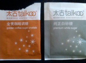
Refined taste.

“Contemporary” was an unexpected word-find in conjunction with a natural sweetener. Then, I learned that Taikoo® is an iconic Hong Kong brand that’s been around since 1881. In fact, it’s the oldest brand from Swire Pacific, whose parent company is U.K.-headquartered and hugely-diversified John Swire & Sons, Ltd. These days the sweet white or golden (raw) crystals are imported, but a refinery operated under the same name for some eight decades.

Picked up at a local coffee chain in Shanghai, these “sachets” sport, cups-down, one of the most sophisticated designs I’ve ever seen on a sugar packet. The Chinese characters and rust+white/grey+white color combos give it the visual edge. But wait: 太 (Tai) = “great” and古 (koo) = ancient. What lofty distinction…and verbally caloric! Premium, indeed.

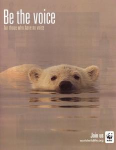
Huntin’ down a tagline.

Huntin’ down a tagline.

I’ve seen these ads in magazines and airports. Unfortunately, the tagline doesn’t do the campaign justice. It would read and look much better as “for those without one.” “Voice,” particularly just south of the very same word in the call-to-action, is clunky and redundant. It waters down the message, rendering it less powerful.

Courtesy of Cali Szczawinski — Las Cruces, New Mexico.

I spied a clever turn of phrase on this campaign button that the owner of Meson de Mesilla penned herself. America, what’s not to agree about here? Let’s come to our senses and vote for reason, substance and the reversal of misfortune we’ve suffered the past 3+ years. Enough of you were naively sucked in by hope and got…nope. For others, “Sí, se puede.” was a catchy, pronunciation-friendly phrase you took a shine to. (Wow, more than a one-syllable slogan and in another language!) Most were baited with change, then switched with “Brother, can you spare some….”

This got me started.

If you gave the inexperienced, unqualified Joebama the nod four years ago, it’s o.k. That happens a lot, so we won’t hold that lapse of judgment against you. However, we do expect you to learn from and avoid repeating the folly. We need a fixer, not a poser. On to the real deal: integrity, resourcefulness, a solid work ethic, admirable intent, good energy and action that promotes and brings about prosperity. Sadly, that is not a lot to ask given the current White House occupant, that questionable American. Which is exactly the point: we need to demand more from our (highest) elected officials. In the same vein, we should also show them the door when they fail to perform to minimum standards. Inviting arrogance and his wrecking crew in for a second try is perversely tantamount to the widespread social passing of undeserving students. We do not need any more lofty, moving target, empty promises from a victimizing, blame-driving, serial apologist.

It is neither crime nor character flaw to have enviable business credentials (at least so far). Nor should jealousy of Mitt’s good fortune and his bank account be in vogue. (That is how certain Europeans have responded towards their fellow citizens who are better off than they are, and look where it has gotten them.) On the contrary, we should only be so lucky to make the most of and embrace the opportunity @MittRomney represents. Who alive, in his right mind and eligible to vote, once and only once, would not prefer a guy who has consistently shown he can create jobs, turn around companies, lead, successfully negotiate, stand for and deliver on said things and initiate and implement improvements? The incumbent is wholly unviable.

Picklers vs. Slicers

Love, love, love cucumbers, especially when the sweeteners and preservatives stay away. This water is very deserving of its name: just the right amount of cucumber essence and oh so refreshing! The fruit’s lore is quirky but “cuke.” Stumped on the trivia question? A hint is right there!  Did you know that cucumbers were first cultivated in Bengal, India over 3000 years ago?

The “Drink water, not sugar”  tagline reinforces the product’s natural slant. A straight and true swipe at the colored-water, “good for you” posers. The name, tagline, logo, green “slice” highlighting the flavor and clear packaging all play nicely together.

Back (roads) stage pass.

It doesn’t take much to get me out the door and exploring. Especially the storied Route 66, a lot of which I have covered…and more than once. I love the name, logo, tagline and shape of the can.

While not a nutritional label reader, I was curious (and all signs pointed to the side of the can). That little detour is where I learned of a new fruit: acerola. Didn’t sound like anything I wanted to pop in my mouth, let alone sip.

Lo and behold, it’s none other than the West Indian, Barbados or Puerto Rican cherry and related to the hawthorn, which the Chinese eat along with their tea. To my etymological surprise, the fruit name is rooted in Arabic al-zu’rur (al- = the + zu’rur = medlar) by way of Spanish. Yet the medlar itself is actually related to (but much smaller than) apples, pears and quinces and has an amazing story of its own. Bletted are its ways.