Archives for posts with tag: naming
Subway's subpar name.

Subway’s subpar name.

This name is awful. Are pizzas anything but flat? The real problem here is in the pronunciation miscue.

Pizza, /peats ah/, with the “zz” sounding like “ts” (as in beats, cheats and Pete’s) distinguishes itself from Pisa, as in the leaning tower kind. The “s” of Pisa is a “z” sound (as in zap, zoom, zip, Zeppelin and Zorro). Yet, Subway has introduced this flatbread/pizza hybrid using the non-pizza pronunciation: -tizza as in “tease ah,” vs. “teats ah,” per the pizza pronunciation route. Customers, relying on the word “pizza” to phonetically guide them, intuitively know something is off, even before the name is out of their mouths. Going for it yields real embarrassment, before and after.

If Subway could only come up with portmanteaus, surely there were legally available options better than this. I wonder what was explored around the descriptors (“cheesy & delicious meets crispy & square” being among “edgy,” “original” and many others). They could have likely reduced the four box top adjectives to two and used some combo of the remaining in the name. Or gone with an un-fused style.

Flatizza, trying too hard to be what it’s not, is outright flat. The name is too close for comfort and so far from good. Let’s hope it wasn’t professionally sourced. If it looks like the bad end of a contest and sounds like the bad end of a contest…it probably is.

To all considering a creative exercise, name fresh!

Hot. Cool. Meh.

Hot. Cool. Meh.

The evocative name of this building at the Sochi Olympics is one of the more unique. Icebergs command attention; they are powerful and beautiful to behold. They also suggest passing grandeur, so I hope the public still has access to it post-Games, unlike Beijing’s Bird’s Nest, which sits empty, even abandoned.

“Iceberg” means well. A tip of the berg for being short, fun to say and easy to remember, but it’s suggestively off. You see, this structure is shades of blue, and more so when lit up at night. Glaciers are blue due to the lack of air in their creeping shelves. In contrast, icebergs — full of tiny air bubbles — are mostly white, as the bubbles’ surfaces reflect light. The blue-ish streaks in an iceberg represent crevasse-filling meltwater that’s refrozen. Air-tight vs. air-light. Similarly, roughly 90% of an iceberg is under water, yet the home of the latest skategate appears largely above-surface. The venue would be better verbally-grounded if more of it had been recessed into the earth.

Which brings me to…if this is an iceberg, what type is it? The terminology of some of the sizes and shapes of these frozen masses are cool. I have seen smaller ones — growlers and bergy bits — in Chile. Shape-wise, the Skating Palace looks like a hybrid: “tabular” for its crew-cut and horizontal banding and “blocky” for the steep sides.

Here’s where the Russians missed. U-shaped bergs, with the bottom of the “U” reaching almost to or at water level and cradled or book-ended by sky-reaching spires, are referred to as “dry-docked.” Considering the lack of natural precipitation at seaside Sochi, officials there could have thrown down some serious naming with “The Drydock” for the half-pipe.

At least they didn’t resort to calling the palace the “Sea-Hill.” Such was the synonym for calved glaciers in the late 17th century. I’m not sure how long that term floated around, but the partially Anglicized Dutch loanword for “ice mountain” obviously got more points for style back then and thus is still in play.

Cannabis on ice.

Cannabis on ice.

At first, I was not sure of the name of this drink. Was the “Swiss maple leaf” a stand-in for a letter? Coice? Caice? O was it merely separating two words? The fact that I bought this in Canada added to the initial confusion. “C” for Canadian? The name was simpler than I thought – C-Ice — but still a little clunky: “C” + “ice” looks shorter than it really sounds. And, I don’t see any value in the reversed second “c.”

Interesting, the verbal and visual plugs for Switzerland. The cube did conjure up ice-capped mountains. (Just looking at the block of ice cooled me down.) However, there is no real logo here, despite the potential for a great one. In a design update, I suggest combining the Swiss flag with the cannabis leaf (given they are both square-ish) for a cannabis leaf-shaped flag…a much more effective message encapsulated within a compact, mobile-friendly footprint with the power to be smokin’ hot, unlike the name.

The taste? Approximating cold yerba mate…refreshingly bitter. Lastly, I couldn’t resist the orange packaging…none other than a Lamican® from Finland. Sturdy, with good print quality and nice in the hand.

Pop music.

Pop music.

Original poster art.

Original poster art.

The

match-up

we’ve

all

been

waiting

for?

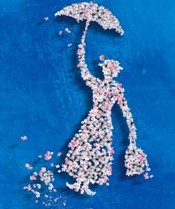
Hardly. I knew there was a lot of gourmet popcorn out there, but “artisanal?” However you describe it, it’s tasty poppiness with a funny name. Wish there had been nuts inside. (Gary, can you fix that?) I think this logo would have looked better had the guy been in motion, like movie Mary. However, on the site, popcorn is raining.

It’s a damp cold…just bone-chillin’ day. Chicken Little me not! Dark and cloudy, but I know the Spring bulbs are lovin’ it.

Geodetically yours.

With a name like this, how could almond clusters go wrong? What? An anonymous suggestion box card says “Lose the radiating almonds; they cheapen the nuclear effect at center stage.” I, myself, like the vertical brown “compass arrow.”

Follow the (imminently) yellow quilt roll.

Cute ad for what it leaves out. The competitor is not named…only referred to as the “ultra rippled brand.” (I take it that weaves are better than ripples.) Granted, some responsibility lies in the hands of the user…how skilled a person is with this tool. If you were new to the brand, the illustration is the first place to get a grip, given that there is no mention at all of the product or product category, or anything that approximates it. This ad is successful only if you have previous knowledge of the Charmin brand, its competition and a good grasp of English. Otherwise, you are just a babe in the woods. The domain: enjoythego.com. Hilarious. Gotta give P&G a hand (a clean one) for making going fun.

Seeds with legs!

I knew what was inside the bag when I bought it, but I did not get that they were mint-flavored. Now, I see that the illustrations were also trying to tell me that (and about their other flavors). The brand is Qia Qia (yep, pronounced like the dance). Sunflower seeds are a common snack for the Chinese. This variety was extra long and slender…the better to cha cha with!

Second-hand with first-hand awareness.

It makes my day when I stumble upon verbal quirkiness. This store was called something else before, something I can’t quite remember. Will I forget it now? Despite the risk of being so closely tied to another brand, given the goods sold here, the name is superb and will have legs longer than the show or the ladies themselves.

The thinking cap is on.


Educated Guess.
Yummier than science.

This winery saves the
fullness for the wine,
and keeps the formulas,
well, mostly to itself.
A twofer in the source:
Roots Run Deep.
Chemistry, indeed.

Hey, bartender, pour me
another glass Guess.

Penguin envy.

Just looking at this happy bird cools me down. Nothing like incorporating these cute little creatures into your design to coax kids to drink what could be directly had from the tap, filtered or not. The name incorporated into the little guy’s eyes is clever. (Does that make him four-eyes?) The portability helps, but it’s not refillable.

Which brings to mind public water fountains. They must be lonely without all that gossip. And so quaint. Yet they are the best way to quench your thirst or wake yourself up with a splash on the face…when you can find one.

The whole bottled water culture is so over. Most is brought to you from the same public source via the good ole faucet. Yet, the continuing brand proliferation in this category never ceases to amaze me. In fact, I was involved in the industry in the early- to mid-1990’s, when I sought out U.S. distributorship for a prestigious Catalan producer of bottled carbonated mineral water. They were ahead of the times. It’s a shame; they’d have made inroads had management been more interested in carving out a niche space with spa clients (which is where their product best fit) or sat out things until the domestic market here became receptive to their offering.

Emergency landing deplaning practice.