Archives for posts with tag: ads
IMG-20110726-00181

Kahlú-a #1: “MUY, not “MOO-ey.”

Don’t know why this Mexican coffee-flavored liqueur adds a stress mark on “muy” in its “drive responsibly” blurb in the left margin. Unlike tu/tú, mi/mí or aun/aún (among others), there is not another word in Spanish with which to confuse it, and thus no need for an accent to differentiate the two. In fact, the stressed “u” here leads to a two-syllable word that rhymes with…uh-oh…“gooey.”

Also, while the brand name is correctly accented below the “DELICIOSO” ribbon (I know, hard to see here), the words “fábrica” and “café” are not. When a Spanish word is capitalized, Spanish speakers often do not use written accents where they would normally be required. However, since KAHLÚA is all caps, I would expect to see FÁBRICA and CAFÉ. Bad Spanish or Spanglish, at least it’s not affecting deliciousness.

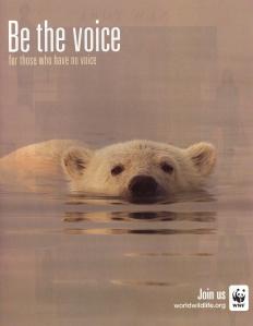
Huntin’ down a tagline.

Huntin’ down a tagline.

I’ve seen these ads in magazines and airports. Unfortunately, the tagline doesn’t do the campaign justice. It would read and look much better as “for those without one.” “Voice,” particularly just south of the very same word in the call-to-action, is clunky and redundant. It waters down the message, rendering it less powerful.

Follow the (imminently) yellow quilt roll.

Cute ad for what it leaves out. The competitor is not named…only referred to as the “ultra rippled brand.” (I take it that weaves are better than ripples.) Granted, some responsibility lies in the hands of the user…how skilled a person is with this tool. If you were new to the brand, the illustration is the first place to get a grip, given that there is no mention at all of the product or product category, or anything that approximates it. This ad is successful only if you have previous knowledge of the Charmin brand, its competition and a good grasp of English. Otherwise, you are just a babe in the woods. The domain: enjoythego.com. Hilarious. Gotta give P&G a hand (a clean one) for making going fun.

American't Express itself.

And, no, that first word in the title there is not short an apostrophe; nor is it French. Why is American Express not forward-thinking in their ads and customer service? We all know they can afford to be. Yet after being a cardholder for 25 years, they have proven they don’t care about loyalty. In fact, they cannot even entertain such a concept, even how-to suggestions. Their worst traits became all the more frequent: outright refusing to listen, completely missing the boat on the ability to learn from their customers and the inflexibility of a spent rubber band. So, with the picture painted, and upon viewing these ads in the June/July Esquire, I wondered:

Q: Why couldn’t legal counsel and/or the marketing team — to talk up their ability to score their members great concert tickets (among other supposed perks of batting their cards around like hummingbirds or starlets with eyelash extensions) — strike up an agreement with some celebrities on tour THIS, NOT LAST summer or fall?
A: Slapping real or fictitious dates on illustrations of tickets (not even images of the tickets themselves) to concerts that took place in 2010 is easier, faster and cheaper. And much less original.

Take a look at either ticket.

Q: So, you mean the privilege of a card with a stiff annual fee only gets me general admission?
A: I guess the negotiations with Ticketmaster weren’t as successful as they’d have liked.

I have seen American Express get uppity with friends and family over the decades, so I guess it was only a matter of time. Alas, in an age when they so openly gloating about their quarterly profits and their customers as being almost exclusively mega-spenders, the fact that their image cannot keep up with their identity is ever more obvious. Maybe research said that braggadocio and “green” underwriters who talk and walk like they just “graduated” kindergarten are the quickest route to new customers. Given where I saw this ad and one of their reps at a public speaking engagement this Spring, that is my impression. AmEx is desperately trying to woo a younger audience but is not in touch with those generations. Three swipes and….amusing to watch this brand derailment. What I call ex-Membership Rewards.

Yes, Napoleon, there is a complex.

“Mascarathon” caught my attention. After reading this Napoleon Perdis ad, though, I realized how off-strategy that header is for what the company is trying to get across here: breadth of play. If the focus were only on making lashes longer, lash extensions or long-lasting mascara, the word would hit the mark, but do I really need a “wardrobe of mascara options?” How realistic is it for women to change their mascara during the day or from day to evening? Yes, we might re-apply, but not if it involved toting around more product. Napoleon lost, indeed.

I want my mascara to multi-task; it should work as hard as I do.

What the company was probably after with “Mascarathon” was the suffix “-athlon,” as in heptathlon and decathlon. Heptathletes and decathletes are versatile performers in multi-sport athletic events. They need different equipment and strategy for each competitive category, if you will, to achieve the desired results. Unfortunately, the –athlon suffix does not score well; it is clunky and hard to pronounce in combination with “mascar-.” Therefore, maybe the change to “-athon.” They were on the right track in fusing two word parts together, but a little verbal strength training would have improved the messaging angle.

“Remember, there are babes in the woods.”

My favorite forest fire prevention PSA out of all of Smokey’s tireless evangelism is “Death rides the forest when man is careless,” which actually predates him. Born in 1943, “the bear/man” is approaching seventy. Take a walk along his trail map of gracious and patient pleas to see how he has grown up yet never aged.

Smokey has always kept good company. From Bing Crosby, Art Linkletter and James Arness (Gunsmoke) in the 50’s and 60’s  to Spock, The Grateful Dead and Cheech and Chong in 1985 radio spots and Sam Elliott (smokin’ himself) in 2008, the threat has evolved in name, too: from forest fires, range fires and campfires to wildfires and backyard leaf burning. HotFootTeddy was kind enough to lend the website images of all kinds of stuffed Smokeys over the decades. Alas, Smokey was more real before CGI rendered him artificial, less personable and convincing — you know, as hollow as that decayed stump over there.

Flustered but batting an eye.

I spy a word that starts with an “f….” Flirt & Flutter is a good evocative name. Initial “f’s” signal a sense of speed (fast, furious, frantic, flip, flash), goodness (fresh, fragrant, freedom, flavor, flush) and lightness (feather, flight, flicker, flury, float). Without any other cues as to the industry they’re in, the salon’s tagline leaves no doubt. The problem is they are trying to be more than what they are. What is it with this lifestyle thing? Just like everyone calling him-or herself an author, every company seems to be copycatting the lifestyle position. Most can’t even remotely deliver. At the very least, one tagline is enough.

Next up is the domain. Either the domain lags behind what may have been a name change from “Flirt & Flutter Lash Loft” to “Flirt & Flutter” or “flirtandflutter.com,” “flirtandflutterbeauty.com,” “flirtandflitterlifestyle.com” and “flirtandflitterboutique.com” (as examples) were already taken. The domain, however, makes the “…a Lifestyle” all the more unbelievable. Trying to be the Sprite in a cola proliferation is not working.

Gul-(lible)pada

No, not the latest Asian model or starlet. I’m talking about SILPADA. They’ve got everything wrong, except their craft. I love sterling silver jewelry, preferably the vintage American Indian and mid-century Nordic kind. For the purist, the only silver is sterling. Unfortunately, sterling doesn’t anything along the lines of a Denomination of Origin that would inform the buyer as to what is and is not sterling, much less to the fact that there is a difference. Part of the problem stems from ignorance (intentional and not). Salespeople say “silver” and only the informed know to ask if it’s real…meaning sterling or .925 or above silver content. Thankfully, this brand is upfront about the quality of its silver; it’s praised as “handcrafted,” yet the company never divulges the origin of the goods outside of the “world.” So, let’s get on with what I’m not sold on.

Nothing is credible in this ad, dated or not, or at the website. The tagline here tells me what they’re peddling, but there’s really no need…could this lady have on any more jewelry? So much is bad taste; it just cheapens the idea…and the wearer. Such a display even cheapens sterling, which has a long-standing image issue to the less artistically inclined. (Some people won’t wear anything but gold, even if it is gold-dipped, vermeil or 10-carat.) Sterling lacks fans mostly due to things like this: poor product design (there’s just no depth or soul to what looks and is overly commercial) and even poorer branding. Also, sterling tarnishes, and people are lazy. They don’t want to do any maintenance on their adornments. But, it’s just like most everything…you need to keep your purses, shoes, teeth and earbuds clean. Gold needs cleaning on occasion, too.

I never could figure out this ad (from InStyle, November 2009) of a few years back (yes, I’m going through some magazine clippings) — What do vacation days have to do with jewelry? I don’t naturally associate “controlling my time” with a vacation. Why do I want to escape with jewelry? Is that my retail therapy? The colors of the gal’s outfit? Again, nothing aspirational.

Fast forward to 2011. OK, so you’re trying to sell me on the idea that a lifestyle consists of pushing your products at hosted parties and plugging your brand whenever I can get a word in? Such is not a lifestyle (a word which is altogether deserving of another post); it’s unrealistic,  another job and would alienate my friends. The Tupperware, Mary Kay and Avon of sterling. Sorry, you three. You’re good. Just referencing the channel. Silpada, it’s demeaning to see you pitch success defined as a lifestyle built around not only wearing gobs of mass-produced sterling silver jewelry, but selling the stuff. (Want a little .925 with that salad?)

I see that they somehow have secured the silpada.com domain (over the previous silpadajewelry.com). I wonder how much that cost them. The name is not bad, but it’s not pretty either. It’s got some VCV (vowel-consonant-vowel) going on, making it easy to pronounce, and the “Sil-“ informs me of the metal, but the name sounds more like a pill or a shoe insert. Font confusion: The font in the name has no personality; they try to make up for it with the arrows, but it doesn’t work. The font in the logo on the home page is different from the font in the “Welcome to….” The current tagline: Live Life in Style.” is over-capitalized and doesn’t need two fonts. It is Bonneville flat (without the speed). So far, between the name and the tagline, I have no idea what line of business you are in. “Sil-“ only helps with a visual cue. I figure it out by a few nav buttons and “financial freedom.” You can never have enough jewelry, but you can wear more than enough.

Travelicious

The first few times I experienced this store, I was impressed. That was a decade or thereabouts in Seattle. Time has been relatively good to this brand, but I am not their target audience (if I ever was). I used to enjoy the mix of seemingly old and new, different labels under one “house,” and the discovery that was always a part of their brand. Just seems that they’ve been on a slide to bland. The clothes look and feel much cheaper now, there’s too much of it out (the racks are clogged). The need to hit the refresh button. The merch is increasingly poorly sewn, knit designs are stamped instead of woven, the countries of origin of the independent labels are more and more those hawking cheap labor, the fabrics are flimsy and lack hand, the amount and sizes of goods put on sale reflect a disconnect with the knowledge of their audiences. The one constant is the catalogs — amazingly concepted and shot — and learning about the occasional label that is one-of-a-kind, sometimes from former Anthropologists. The ‘logs “transport” you, even though they keep their locations a secret, which is silly. Their online vintage offerings are remarkable particularly with respect pricing. The stores are still fun for a quick walk-through now and then, less now and more then.

All puffed up and no air to go.

Let’s get one thing straight. The World Wide Web is not a product of Lufthansa. Keep reading…the disclaimers get more granular, yet nebulous as you go down the page. Lufty, I’ll take your word that you offer broadband Internet service across the ocean. But wait. The fine print says it’s only on transatlantic flights. Oh, and with my loupe I now see that it is available only on “select North Atlantic routes.” This ad is as shifty as the onboard service is sketchy. True, there IS a better way to fly, but it’s not with you.