Archives for category: Naming
Maybe it’s May-bell-ina.

Maybe it’s May-bell-ina.

I’d love to be in France today. Not because it’s International Labor Day or May Day, but because I could easily get my hands on a bunch of lilies of the valley. Every May 1st, the French celebrate the white, bell-shaped blossoms in the Fête de muguet or Lily of the Valley Festival.

Sweethearts once gave each other bouquets or sprigs of these diminutive sprays on this day. Those in the know still do. You see, it signals the return of happiness in floral speak. The tradition also lives on for this harbinger of Spring Summer as people exchange potted plants of the dainty bubbles peering out from green-sheathed stalks. For its scent, shape, color symbolism and delicate structure, this lily’s an ever-popular, if not expensive, bridal choice. If it’s good enough for Kate Middleton….

A lily of the valley by any other name? OK, I’ll agree with Juliet on this. There’s Lady’s tears (the drooping blooms evoking such), which might explain why ladies wore a stem upside-down on their dresses…the better to catch a glimpse or waft of their inner beauty. And Mary’s tears (for those shed at the cross). The botanical name, convallaria majalis, meaning “valley” (in reference to its preference for lowland habitats) and “of May” gives us May lily and May bells as alternates.

From lush, broad leaves emerge perishable tender hoods. Images of lily of the valley were common on postcards during the mid- to late-1800’s. Yes, floral-obsessed Victorians can claim to be the original flower power culture, often setting out on a lily picnic on Whitsunday (the British associated the LOTV with the return of the Holy Spirit to the Apostles) to gather wild ones in the nearby woods.

Aahhh! Alongside fragrant gardenias and hyacinths, the sweetest things.

Subway's subpar name.

Subway’s subpar name.

This name is awful. Are pizzas anything but flat? The real problem here is in the pronunciation miscue.

Pizza, /peats ah/, with the “zz” sounding like “ts” (as in beats, cheats and Pete’s) distinguishes itself from Pisa, as in the leaning tower kind. The “s” of Pisa is a “z” sound (as in zap, zoom, zip, Zeppelin and Zorro). Yet, Subway has introduced this flatbread/pizza hybrid using the non-pizza pronunciation: -tizza as in “tease ah,” vs. “teats ah,” per the pizza pronunciation route. Customers, relying on the word “pizza” to phonetically guide them, intuitively know something is off, even before the name is out of their mouths. Going for it yields real embarrassment, before and after.

If Subway could only come up with portmanteaus, surely there were legally available options better than this. I wonder what was explored around the descriptors (“cheesy & delicious meets crispy & square” being among “edgy,” “original” and many others). They could have likely reduced the four box top adjectives to two and used some combo of the remaining in the name. Or gone with an un-fused style.

Flatizza, trying too hard to be what it’s not, is outright flat. The name is too close for comfort and so far from good. Let’s hope it wasn’t professionally sourced. If it looks like the bad end of a contest and sounds like the bad end of a contest…it probably is.

To all considering a creative exercise, name fresh!

Conversion Conference Tagline (Duplication)Salary.com taglineSinger Tagline (Duplication)

Within branding, little is more annoying than seeing a company blow a great messaging opportunity: a name or part thereof that repeats itself in the tagline. And a few more:

Ally Bank            Everyone needs an ally.
CenturyLink        Your link to what’s next.
Vahan                 Alwand Vahan

Such lack of creativity doesn’t speak well for the discipline or the “disciplineer.” Rather than slapping a flat, thoughtless tagline under the name, leave it out.

A tagline is not the place to “tell them what you’re going to tell them” and then “tell them,” because you’ve then run out of time and space to “tell them what you just told them.” Doubling up on the name in the slogan is disrespectful to the audience…and just as you were getting their attention! In fact, not being able to come up with a short, original phrase that complements and/or reinforces the name is a common brand wasteland. Most “straplines” (as they are called in the UK) are largely visually experienced, so it is all the more surprising to see how many resources go towards a name and logo, leaving the tagline to be the afterthought and looking it all the way.

A good tagline furthers brand messaging and and strengthens positioning. As a name usually only conveys two or three traits, the tagline is the chance to say something strategic about the brand that did not make it into its hardest-working asset. Great taglines — you’ll recall “Just do it.” and “We bring good things to life.” — are born from compatibility with the naming structure and style, the sharing of additional meaning, a passion revealed and a personality defined. They transcend their typical real estate, emerging literally and figuratively out from underneath the respective name to achieve stand-alone stature and staying power in their viral journeys.

Before we leave, let’s get to some general fixes. One option is to simply remove the word or wordmark from the tagline when the two appear together, as with Singer. This may require a little tweaking of the initial phrase. Nothing fancy. Salary.com could swap out “salary” for “figure” or “number.” Either is much more interesting and adds depth. With the Conversion Conference, it may take several words or a phrase to stand in for the repeat offender. Nothing major; a quick read of the session topic blurbs and the logo give me several ideas already. Lastly, Vahan should start over. Without visual cues, some previous knowledge of the brand or seeing the domain, vahanjewelry.com (at the bottom of a recent ad showing retailers that carry the line), I have no idea what the company stands for or sells.

Given the difficulty in securing a legally-viable name and domain, the tagline can and often is a name’s best friend. If you’re strapped for creativity and time, Devign can find you both. Strapping results and in spades.

An un-medicated high.

An un-medicated high.

Needing to quench my thirst, I bought this Indian carbonated water for the illustration and tagline combo as well. I was already in the Himalayas, heading to Bhutan or on my way back. So, there!

Next logo change, I’d move “Lehar” to the bottom or back and let the mountains and “Evervess” take the spotlight. The maker’s prominent display (on its bottles and snack packages) is akin to “The Coca-Cola Company” splashed center stage on every beverage it sells, regardless of whether Coke, Sprite or Dasani is inside.

“Evervess” is powerful. It’s evocative, fun to say and onomatopoeic. Starting off strong with the stressed initial “E,“ the name then softens out…much like any gaseous beverage action. What’s more, it’s suggestively descriptive: the drink is super-fizzy, as another fan attests. — ¡!¡!¡!¡!¡!¡!¡!¡! — I love the visual and verbal references to both “effervescent” and Mt. Everest. Bubble on!

Backstory: Lehar is a brand of soft drinks and salties owned by PepsiCo. From 1988, when the company entered the subcontinent’s market, until the ban on using foreign brand names was lifted in 1991, PepsiCo was forced to use an Indian name, even on its flagship drink. Pepsi Era? Not allowed. Lehar Pepsi (lehar = wave)? Approved. PepsiCo marketed its products under this former Indian joint venture label until it bought out its partners in 1994.

Sourced: Thailand/Bhutan.

I spy golden trumpets.

I spy golden trumpets.

My parents bought an old farm when I was in high school. The barn area had masses of daffodils fanning out like the sea from land-locked oaks and magnolias. Picking yellow ‘til I was blue in the face was a ritual. I miss that annual carpet of happiness.

Daffodils are hard to pin down. The late-16th-century word for what you see above went through several linguistic twists but is rooted in the Greek asphodelos, which in turn is of unknown origin.

Daffs are sort of stuck on themselves. In a fake, self-love-practicing kind of way. Their Latin name? Narcissus pseudonarcissus. (Why, thank you, Carl.) 50% ego; 50% not.

Daffodils are sneaky. So where did these yellow-crowned, graceful ballerinas spring from? Who gave them that tenacious d-? Sources say the Netherlands are to blame. Specifically, the Dutch language: its definite article, “de,” hooked up with the affable bulb, affodil. And there you have the story of stunning, sunny glory.

Hot. Cool. Meh.

Hot. Cool. Meh.

The evocative name of this building at the Sochi Olympics is one of the more unique. Icebergs command attention; they are powerful and beautiful to behold. They also suggest passing grandeur, so I hope the public still has access to it post-Games, unlike Beijing’s Bird’s Nest, which sits empty, even abandoned.

“Iceberg” means well. A tip of the berg for being short, fun to say and easy to remember, but it’s suggestively off. You see, this structure is shades of blue, and more so when lit up at night. Glaciers are blue due to the lack of air in their creeping shelves. In contrast, icebergs — full of tiny air bubbles — are mostly white, as the bubbles’ surfaces reflect light. The blue-ish streaks in an iceberg represent crevasse-filling meltwater that’s refrozen. Air-tight vs. air-light. Similarly, roughly 90% of an iceberg is under water, yet the home of the latest skategate appears largely above-surface. The venue would be better verbally-grounded if more of it had been recessed into the earth.

Which brings me to…if this is an iceberg, what type is it? The terminology of some of the sizes and shapes of these frozen masses are cool. I have seen smaller ones — growlers and bergy bits — in Chile. Shape-wise, the Skating Palace looks like a hybrid: “tabular” for its crew-cut and horizontal banding and “blocky” for the steep sides.

Here’s where the Russians missed. U-shaped bergs, with the bottom of the “U” reaching almost to or at water level and cradled or book-ended by sky-reaching spires, are referred to as “dry-docked.” Considering the lack of natural precipitation at seaside Sochi, officials there could have thrown down some serious naming with “The Drydock” for the half-pipe.

At least they didn’t resort to calling the palace the “Sea-Hill.” Such was the synonym for calved glaciers in the late 17th century. I’m not sure how long that term floated around, but the partially Anglicized Dutch loanword for “ice mountain” obviously got more points for style back then and thus is still in play.

Valentine Rituals, Part I

Valentine Rituals, Part I

It pays to root around aimlessly some times, as you never know what you will dig up. For curious types like myself, the chance to unearth possibilities, dust off the past or shape the future are must-haves in our lives. Here is a linguistic morsel paraphrased from Forgotten English by Jeffrey Kacirk:

Choice words. Originated by Chaucer himself, piggesyne (literally, a darling little pig’s eye) was once a term of endearment for one’s sweetheart. The English poet is also credited with inspiring the tradition of sending love notes on Saint Valentine’s Day.

From name drawing to destiny calling. Pre-19th century bachelors drew maidens’ names from a box or hat as their valentine for the year. The Church tried to graft a religious holiday onto this long-standing tradition by substituting saints’ names for those of the opposite sex, but this attempt proved unpopular and was abandoned by the 16th century. The drawing of names was taken somewhat seriously according to Henry Bournes in his 1725 Antiquities of the Common People: “It is a ceremony, never omitted among the vulgare, to draw…a name, which is called their Valentine, and is also look’d upon as a good omen of their being man and wife afterwards.”

IMG_1480

All-weather, all-natural, all-terrain comfort.

Given my weakness for colder weather and passion for the polar and high-latitude regions, I’m happy to report that this base, layering and outerwear line is as high-performing as the name. Close-fitting, stylish, warm, itch-free and with quality zippers. These are the pieces you’ll wear ‘til the sheep come home. Baaaaaaa!

Even if you never break a sweat or step off the sidewalk, this is wool like you’ve never seen, felt or smelled. The “Think, don’t stink.” tagline is a layering of its own kind… a meaningful, catchy and memorable phrase that adds energy and fun to the brand.

Leave it to the Kiwis to take us back to the sustainable farm and the four-legged beginnings of what’s on our own two now. Per their unique “baacodes,” I traced my light-grey top to a single ranch, Kennethmont. My dark grey top’s fibers come from four of 120 sheep stations: Lindis Peaks, Glenmore, Otematata and Waitangi. Thanks, Icebreaker, for “new-schooling” wool.

IMG_1531

Come what may….

I stumbled upon this place in the town over. A shame they did not hit the mark with the logo. Kumquats are so beautiful; they are pretty on and off the tree. Citrusy goodness, too…skin and all!

No matter what might be happening, get to Watkinsville soon for a simple (but not simple-tasting) home-cooked breakfast or lunch while you take in the local art on the wall.

IMG-20120208-01482

Refined taste.

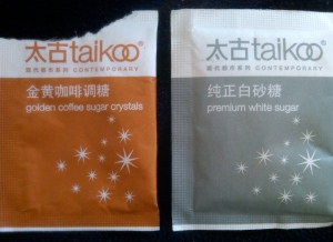
“Contemporary” was an unexpected word-find in conjunction with a natural sweetener. Then, I learned that Taikoo® is an iconic Hong Kong brand that’s been around since 1881. In fact, it’s the oldest brand from Swire Pacific, whose parent company is U.K.-headquartered and hugely-diversified John Swire & Sons, Ltd. These days the sweet white or golden (raw) crystals are imported, but a refinery operated under the same name for some eight decades.

Picked up at a local coffee chain in Shanghai, these “sachets” sport, cups-down, one of the most sophisticated designs I’ve ever seen on a sugar packet. The Chinese characters and rust+white/grey+white color combos give it the visual edge. But wait: 太 (Tai) = “great” and古 (koo) = ancient. What lofty distinction…and verbally caloric! Premium, indeed.