Archives for posts with tag: packaging
Please, porridge hot!

Please, porridge hot!

Great Scott! What spelling have we here? This hot dish also goes by porrige and parritch. According to the product’s website, “porage” comes from an old Scottish word, poray, and the French potage, for soup. Trademarked in 1914, the phrase “Porage Oats” was meant to distinguish it from rivals’ more descriptive “oat flakes.”

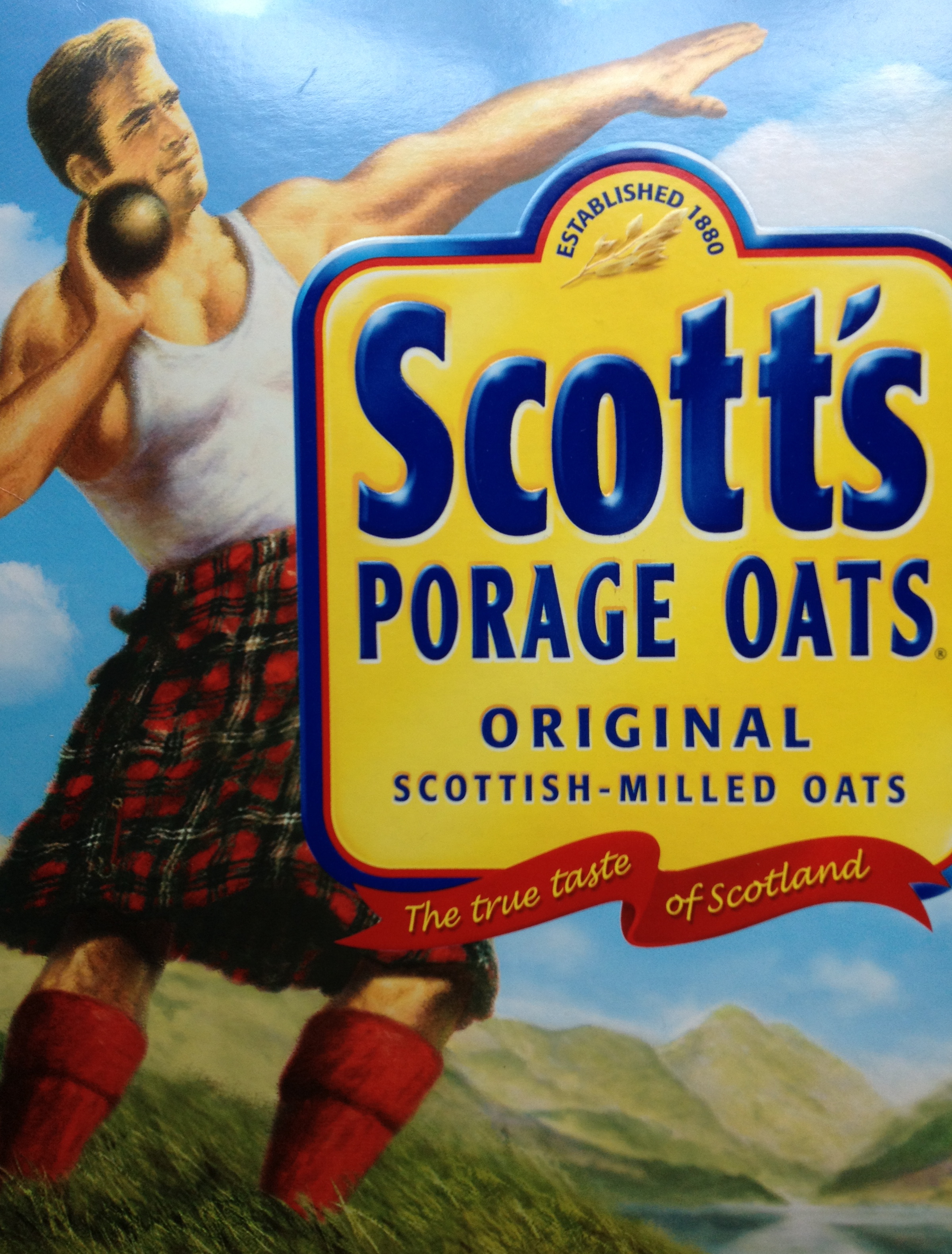
Symbolizing vigor, health and cultural pride, the kilted shotput thrower has been pulling his weight by pushing things further since 1924. The original champion of breakfasts.

After being the subject of two mid-20th century acquisitions, the 1880-established A&R Scott Company was bought in 1982 by one of its main competitors, Quaker Oats, Ltd. As heritage would have it, the mill at Cupar that the original manufacturer purchased in1947 has become Quaker’s sole supplier of rolled oats for all of the EMEA markets. A feat of stamina and distance, indeed.

Bonus: What does “doing porridge” mean? And no Googling.

Sourced: The Caribbean.

Piggybacking Crayola®

I remember these candles looked an awful lot like Crayola® Crayons, which gives you an indication of how long I’ve kept this packaging. I was a heavy user at one time…of crayons and candles. Guess I was also into brands and trademark protection since before I knew it.

I always meant to send this box to Binney & Smith to see what their legal counsel would have to say of the trade dress. Like I said, I meant to. Warning labels these days usually defy common sense.

Edible wallpaper.

Just looking at this packaging can will me to forego the chocolate it envelops, if only for a while. O brothers, where art thy wallpaper? Founding siblings, Rick and Michael, coax out superb chocolate. Their “love affair with the spirit of craft” starts with being highly selective in sourcing the cacao beans and doesn’t end on the production floor. No siree. The bars come to you hand-swaddled in foil and paper. None is less than 70% cacao and most are above that intensity.

Their double red-headed, mast-like “M” logo befits the pair’s down-to-earth quirkiness, even echoing shared facial features. Definitely a hands-on experience. I can almost smell the factory from here.

It’s what’s on the inside that counts.

Savory meets sweet in this edible non-fiction from Mars. Go out and buy a bag. Then, share it.

Did you know that the candy’s name comes from the surnames of the founders? Yep, Mars and Murrie. Here’s to privately-held companies!

Seeds with legs!

I knew what was inside the bag when I bought it, but I did not get that they were mint-flavored. Now, I see that the illustrations were also trying to tell me that (and about their other flavors). The brand is Qia Qia (yep, pronounced like the dance). Sunflower seeds are a common snack for the Chinese. This variety was extra long and slender…the better to cha cha with!

Penguin envy.

Just looking at this happy bird cools me down. Nothing like incorporating these cute little creatures into your design to coax kids to drink what could be directly had from the tap, filtered or not. The name incorporated into the little guy’s eyes is clever. (Does that make him four-eyes?) The portability helps, but it’s not refillable.

Which brings to mind public water fountains. They must be lonely without all that gossip. And so quaint. Yet they are the best way to quench your thirst or wake yourself up with a splash on the face…when you can find one.

The whole bottled water culture is so over. Most is brought to you from the same public source via the good ole faucet. Yet, the continuing brand proliferation in this category never ceases to amaze me. In fact, I was involved in the industry in the early- to mid-1990’s, when I sought out U.S. distributorship for a prestigious Catalan producer of bottled carbonated mineral water. They were ahead of the times. It’s a shame; they’d have made inroads had management been more interested in carving out a niche space with spa clients (which is where their product best fit) or sat out things until the domestic market here became receptive to their offering.

Emergency landing deplaning practice.

Need more be said? Don’t mind me, Harvard. Just playin’ with words here. And a family name.

Coconut that is over the rainbow.

Chips, that is. And why leave Dad and your siblings out when food is this viral? I bought these roasted-then-baked confections almost exclusively for the illustration, despite a weakness for coconut. Good thing, because the name is its low point. Sorry, Danielle, but these treats deserve more verbal personality…one that teases as well as it tastes. In fact, I’d even pay more than the already exorbitant $4.75 for 2 ounces if the name were more suggestive, even arbitrary or, at the very least, playful. Danielle is flat on the palate, whereas these chips are anything but. They are the Lays® of coconut: betcha can’t just eat one.

Danielle makes small batch chips from other exotic and not so exotic fruits, and the illustrations are as authentically botanical as this for the mighty coconut. Any of these would fetch “top swap” in the school cafeteria, particularly for budding designers. I tried two more (jackfruit and honey banana) of the many flavors, but it seemed I’d already tasted something similar before. If I were Asian, one thing I’d miss living here in the U.S. is the dearth of coconut edibles. Now, if only these came in larger packages.

Portable Polynesia

I’m a sucker for packaging if you’ve not figured that out by now. I’d just had my first surfing lesson on Maui, and the waves were calling me back. Since I couldn’t get to Hawaii, I had Hawaii come to me, Kona-style and bottled. They brand the heck out of this carton, yet it still feels as free and open as being out on the Pacific. The story on the bottom of the packaging sets the mood, but it’s what’s on the top that makes me grab for the 6-pack in the first place: “Liquid Aloha.” Aah, Coca-Cola can’t touch that for “refreshing” and “happiness.” There was fun under the bottle caps as well, with each one teaching me a word in Hawaiian:

“Aruba, Jamaica, ooo I wanna take ya…”

Moana = ocean
Kanaka – person
Wai = water
Honu – turtle
Mano = shark

Pringles: all tuckered out.

One way to leave your brand.

These ads are ridiculous. Really painful to see what this brand has become. The circa Laura Ingalls man and loudspeaker look like Mr. Whipple with gastritis. With the 57th way to enjoy these crisps being called “The Pucker-Up,” I cringe to think how they named the other 99 ways, although I can bet you 95 or so don’t exist. The only redemption the Procter Gamble Co. (PG) gets for producing such lame ads and letting the brand flop to irrelevancy is that in April they offloaded Pringles to Diamond Foods (DMND) for $1.5 billion. Yes, with a “b.”

It helps to know that these chips are sold in over 140 countries, often nodding to regional preferences, like the cucumber-flavored ones I found in China. Those were so mild, I had to be reminded of what I was eating. Luckily, I discovered Flutes, which completely outdid them in taste, shape and durability. Yes, there is such a thing with chips — durability, that is; the one reason these have to be sold in a can is to keep them from looking like sand at their destination. As the last of P&G’s food brands to be shed, the company can now focus on its core cosmetics and healthcare units. Let’s hope this is a good buy for Diamond. They have their work cut out for them in bringing this brand back to its game. Let the crisps begin…again!