Archives for category: Packaging
Chic cacao: for the peeps, by the peeps.

Chic cacao: for the peeps, by the peeps.

Happy Easter, y’all! In Finland, nothing says “Hyvää Pääsiäistä!” like the Mignon, a handmade chocolate egg “nougated” out with almonds and hazelnuts and poured into a real eggshell. A Fazer classic since 1896 (outside of WWII), and the Finnish company’s second oldest product, the egg was a favorite of the Russian czar’s family. To this day, the confection (originally from a German recipe) can only be found around Easter in-country and in select export markets…the US not being one of them. For all those coveting one (or more) for your children’s baskets, you can hippity hop here and there. Your very own virtual hunt.

To see how these treats are filled, finished and packaged once the eggshells are sorted and cleaned, YouTube delights.  The original contents of the natural vessels go to commercial kitchens, with nary a yolk or white wasted. About 2.5 million “containers” are sourced from all over Finland. Only the best of a certain size adhere to the 54 gram weight restriction. About 2 million eggs are sold annually — impressive, considering the majority of sales occur at home, a nation of a little over five million. There is nominal distribution to Scandinavia, Russia, Germany and Canada. But, the “bunny” (as in burning, haha) question is why these are not more widely distributed. Why do Canadians have the closest luck?

Decorating ideas abound at Fazer.fi on how to trick out the plain shells. After all, it is a blank canvas. But why not make them in assorted colors from the get-go? I’m “dying” to know what sustains the supposed Henry Ford-esque “any color so long as it’s white” tradition. Has the family-run business forgotten that Karl Fazer, the founder, had an appreciation for design and packaging, which he picked up while on professional stints in Berlin and Paris? He was also known to be a visionary marketer, placing advertisements on Helsinki’s streetcars as early as the end of the 19th century.

Naming new products was a celebrated family affair, with Karl and his wife, Berta, letting their four children in on the creativity. It was the patriarch’s time in France that likely influenced the ovoid’s name: mignon means cute, adorable and lovely in French. Each is pretty much that…in a nutshell.

Extra, eggstra! You can read more about these solid chocolate ambassadors if you’re proficient in Finnish. There are no teasers about Mignons on the English site, I suppose, because they’re not sold here. Bock, bock, bock, bock, bock! Who needs chickens when you’ve got Fazer.

Fiber calling!

Fiber calling!

I bought this box for the retro graphics, not having any idea what benefits psyllium husk offered. And what was the significance of the telephone, other than the side panel calls the product the “telephone brand?” Does “Sidhpur” mean phone? And why is the phone a two-handed relic? It probably dates to the factory’s founding, but, Lord have mercy.  Love the smokestacks, though…belting out the stuff, huffing and puffing the way the wind blows.

About psyllium seed husk. It’s a dietary supplement to maintain or improve one’s gastrointestinal tract. India’s and Pakistan’s answer to Metamucil or Serutan (now dead but an interesting name that spawned “backward” jokes and other similarly-spelled brands), you might say. (Metamucil supposedly contains psyllium husk as its main ingredient.) The milled form here can be mixed with a glass of water, syrup, milk, fruit juice, salted curd or lassi. I didn’t try it, so I’m not sure of the taste, if any. Gluten-free baked goods containing the husks benefit from the latter acting as a binding agent, making bread, cookies and cakes less c–r-u-m–b-l-y.

Don’t overdo it, however. Steady exposure to the dust can cause allergic reactions. Consuming too much of the fiber can actually obstruct the GI tract, if you believe the FDA. And, if you don’t mix the husks with enough liquid (1-3 teaspoons per glass), there’s even a choking hazard, especially by people with esophageal narrowing or abnormalities or those who have difficulty swallowing. Which is when and why you’ll need the phone!

Sourced: India via Thailand.

Please, porridge hot!

Please, porridge hot!

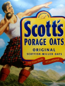
Great Scott! What spelling have we here? This hot dish also goes by porrige and parritch. According to the product’s website, “porage” comes from an old Scottish word, poray, and the French potage, for soup. Trademarked in 1914, the phrase “Porage Oats” was meant to distinguish it from rivals’ more descriptive “oat flakes.”

Symbolizing vigor, health and cultural pride, the kilted shotput thrower has been pulling his weight by pushing things further since 1924. The original champion of breakfasts.

After being the subject of two mid-20th century acquisitions, the 1880-established A&R Scott Company was bought in 1982 by one of its main competitors, Quaker Oats, Ltd. As heritage would have it, the mill at Cupar that the original manufacturer purchased in1947 has become Quaker’s sole supplier of rolled oats for all of the EMEA markets. A feat of stamina and distance, indeed.

Bonus: What does “doing porridge” mean? And no Googling.

Sourced: The Caribbean.

You say Autumn, I say Fall.

You say Autumn, I say Fall.

The yellows this season have been spectacular: Ginkgos, buckeyes, chrysanthemums, hickory trees, poplars and aspens, to boot.

The reds and purples cannot be bested: Dogwoods, Japanese maples, burning brush bushes, mountain apples and sorghum.

Orange is the new neutral: Jack o’ lanterns, fothergilla, oaks, mini pumpkin trees, Chinese lanterns, red kuris and butternuts.

Green is the hang-on color: Pines, green hubbards, magnolias, acorn squash, cha cha kabochas and jarrahdales.

Brown and black won’t be left out, either: Acorns masting and brittle leaves descending — those aerial concerts; bark and branches don’t get much respect.

And finally, white not? Casper and great white pumpkins and snowball mums stir us to what’s next.

Tie-dye foliage…none of which blues me. Now, just who will bottle this?

IMG_1478

Hands-on clean.

Last summer I flew Canadian North, which is 100% Aboriginally-owned, from Inuvik to Norman Wells, then to Yellowknife and on to Edmonton. Really enjoyable. The aircraft interiors looked a bit worse for wear, but each boarding, deplaning and in-flight experience was what flying used to and probably never will be again most anywhere else. Genuine, courteous and attentive attendants, decent and more than enough food, on-time departures and arrivals, fee-less checked luggage that arrived when I did and respectful fellow passengers. From the counter folks to the ramp and baggage people (sometimes one in the same person), they were efficient, approachable and looked like they enjoyed their jobs. Humans. Not rude, insensitive, barking corporate bots with attitude. We’re talkin’ serious customer service.

Which brings me to the airline’s tagline: “Seriously northern.” Some 50% redundant, given their name, but the first half is a winner and with so much potential. The polar bear and midnight sun logo were spot-on geographically but seemed inconsistently illustrated (even dated) alongside the more simply drawn yet delightful in-flight branding. What I most liked, design-wise, were the hand towel packaging and the coffee cup (for another post). On the wipe: “Seriously clean.” — the native drummer dressed in traditional skins and snowy owl (ookpik) culturally reflecting the Northwest Territories’ First Nations who live near the Arctic Circle. A great start, if not messaging teasers. I’d love to see the brand really come alive through many more elements on board, at the gate, in uniform and online.

IMG-20120208-01482

Refined taste.

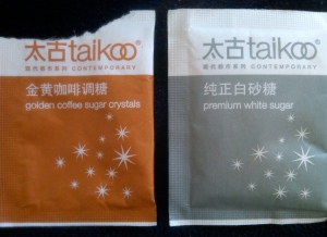
“Contemporary” was an unexpected word-find in conjunction with a natural sweetener. Then, I learned that Taikoo® is an iconic Hong Kong brand that’s been around since 1881. In fact, it’s the oldest brand from Swire Pacific, whose parent company is U.K.-headquartered and hugely-diversified John Swire & Sons, Ltd. These days the sweet white or golden (raw) crystals are imported, but a refinery operated under the same name for some eight decades.

Picked up at a local coffee chain in Shanghai, these “sachets” sport, cups-down, one of the most sophisticated designs I’ve ever seen on a sugar packet. The Chinese characters and rust+white/grey+white color combos give it the visual edge. But wait: 太 (Tai) = “great” and古 (koo) = ancient. What lofty distinction…and verbally caloric! Premium, indeed.

Cannabis on ice.

Cannabis on ice.

At first, I was not sure of the name of this drink. Was the “Swiss maple leaf” a stand-in for a letter? Coice? Caice? O was it merely separating two words? The fact that I bought this in Canada added to the initial confusion. “C” for Canadian? The name was simpler than I thought – C-Ice — but still a little clunky: “C” + “ice” looks shorter than it really sounds. And, I don’t see any value in the reversed second “c.”

Interesting, the verbal and visual plugs for Switzerland. The cube did conjure up ice-capped mountains. (Just looking at the block of ice cooled me down.) However, there is no real logo here, despite the potential for a great one. In a design update, I suggest combining the Swiss flag with the cannabis leaf (given they are both square-ish) for a cannabis leaf-shaped flag…a much more effective message encapsulated within a compact, mobile-friendly footprint with the power to be smokin’ hot, unlike the name.

The taste? Approximating cold yerba mate…refreshingly bitter. Lastly, I couldn’t resist the orange packaging…none other than a Lamican® from Finland. Sturdy, with good print quality and nice in the hand.

Pop music.

Pop music.

Original poster art.

Original poster art.

The

match-up

we’ve

all

been

waiting

for?

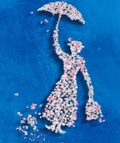
Hardly. I knew there was a lot of gourmet popcorn out there, but “artisanal?” However you describe it, it’s tasty poppiness with a funny name. Wish there had been nuts inside. (Gary, can you fix that?) I think this logo would have looked better had the guy been in motion, like movie Mary. However, on the site, popcorn is raining.

It’s a damp cold…just bone-chillin’ day. Chicken Little me not! Dark and cloudy, but I know the Spring bulbs are lovin’ it.

Piggybacking Crayola®

I remember these candles looked an awful lot like Crayola® Crayons, which gives you an indication of how long I’ve kept this packaging. I was a heavy user at one time…of crayons and candles. Guess I was also into brands and trademark protection since before I knew it.

I always meant to send this box to Binney & Smith to see what their legal counsel would have to say of the trade dress. Like I said, I meant to. Warning labels these days usually defy common sense.

Edible wallpaper.

Just looking at this packaging can will me to forego the chocolate it envelops, if only for a while. O brothers, where art thy wallpaper? Founding siblings, Rick and Michael, coax out superb chocolate. Their “love affair with the spirit of craft” starts with being highly selective in sourcing the cacao beans and doesn’t end on the production floor. No siree. The bars come to you hand-swaddled in foil and paper. None is less than 70% cacao and most are above that intensity.

Their double red-headed, mast-like “M” logo befits the pair’s down-to-earth quirkiness, even echoing shared facial features. Definitely a hands-on experience. I can almost smell the factory from here.